
When Nintendo of America's president calls unexpectedly, you don't ask questions - you answer. That was designer Chris Maple's approach in 1998 when he received advance notice about an impending call from then-president Minoru Arakawa. As owner of Media Design, a Seattle-based firm specializing in emergency creative solutions, Maple was accustomed to high-pressure corporate requests from clients like Boeing and the Seattle Mariners.
The Unexpected Pokémon Assignment
Summoned to Nintendo's Redmond headquarters, Maple found himself staring at an unusual lobby centerpiece - a striking crystal horse head sculpture - while waiting nervously for his meeting. "You develop an instinct for reading corporate environments," Maple reflects about that formative moment.
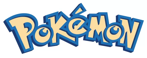
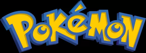
The meeting would change everything. Arakawa presented Maple with a cardboard box filled with strange drawings and small toys, including a tiny Pikachu figurine. "We need a logo for this," Arakawa explained, revealing Nintendo's plans to localize Pocket Monsters as "Pokémon" for Western markets. The catch? Maple had just thirty days to create an iconic mark that would appear everywhere from Game Boy screens to massive retail displays.
Designing Under Pressure
Faced with minimal reference material beyond early Nintendo Power magazines and a shoebox of prototypes, Maple worked intensely at his light table, sketching numerous variations. Through multiple iterations, he gradually refined the dynamic typography that would become one of gaming's most recognizable symbols.
His final presentation included several options, but Maple knew immediately which version resonated when executive Don James declared, "That's the one." The chosen design had an undeniable energy - a quality Maple still struggles to articulate beyond saying "it just felt right."
The Logo's Evolution
After its E3 1998 debut, Maple was called back for slight refinements to the "P" and "E" characters, resulting in the familiar final version. In the following months, he continued working with Nintendo on projects including Major League Baseball Featuring Ken Griffey Jr. and the Atomic Purple Nintendo 64 packaging redesign.
The logo's true impact didn't sink in until months later, when Maple saw it emblazoned across a massive Toys "R" Us display. "Holy smokes," he remembers thinking, "This is crazy."
A Lasting Legacy
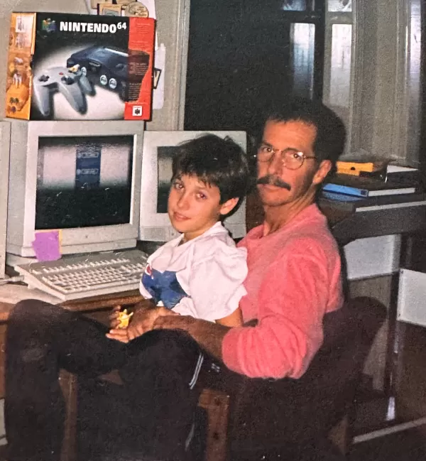
For decades, Maple remained silent about his role due to industry norms around logo design credits. Now, prompted by conversations with his son, he's sharing the remarkable story behind gaming's most enduring mark.
As Pokémon approaches its 30th anniversary, Maple hopes The Pokémon Company might invite him to help commemorate the occasion. "There's a responsibility that comes with this legacy," he reflects, noting how the logo continues to captivate students when he reveals his connection during art workshops.

From a last-minute assignment to a cultural touchstone, Maple's thirty-day creation has outlasted even Nintendo's mysterious crystal horse head - whose existence we've now verified through archival research. Some designs, it seems, really do capture lightning in a bottle.
 Latest Downloads
 Downlaod


 Top News